Rainbow splash to electric green: the best (and worst) kits in MLS history | Football
What makes a good soccer kit? For some, bold and brash is best. For others, clean and simple works. Some fans remember their favourite kits not on the basis of their design, but on what their team achieved wearing them. And yet there are some kits that rise to the surface as era-defining or iconic.
Major League Soccer might not have the long and storied history of other competitions, but it has had more than its fair share of memorable kits in 25 years of existence. Some weird, some wonderful. Some revered, some despised. The line between good and bad can be blurred sometimes, but there are 10 of the best kits in MLS history (and one of the worst).
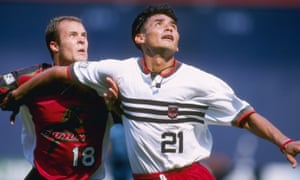
Quite simply, the greatest MLS kit of all-time. Designed by the same man who’d come up with the Michael Jordan “Jumpman” concept for Nike, this DC United kit for their inaugural season back in 1996 is the most classic of classic MLS kits. From the three-stripe design across the chest and thighs to the stern eagle crest, this was quintessential MLS 1.0 and established a template which still informs DC United kit designs to this day. And that’s before we even get to the way this kit was unveiled.
2) Kansas City Wizards 1997 Primary
Experimentation is now frowned upon in the age of monochrome MLS kits, but the league was once an arena of new ideas in its early years and nothing epitomised this better than the Kansas City Wizards’ primary kit for the 1997 season. The waves of colour across the chest became one of the most recognisable kit features in MLS history, while the mesh material meant fans became familiar with the nipples of their favourite players, whether they wanted to or not.

For years, the sash had been synonymous with the LA Galaxy, but that was before they ditched the green and gold look in time for the arrival of David Beckham in 2007. The Galaxy brought it back for the 2012 season and incorporated it into their more modern blue and white colour as they won their second successive MLS Cup. Beckham said goodbye to the league in style, both in the silverware he held aloft and in the kit he wore.
Some kits meet at the cross-section of classic design and historic achievement, and that is certainly the case with this Chicago Fire effort. Led by Bob Bradley, the Fire won MLS Cup in their expansion season, a feat that has never again been matched in the league’s history, and they did so wearing a kit that would establish the club’s trademark look until this year’s catastrophic rebrand.
5) Los Angeles FC 2018 Primary
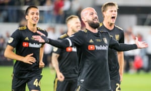
Some were underwhelmed when Los Angeles FC unveiled their black and gold kit for their expansion season in 2018, but it has become much loved. The YouTubeTV sponsor’s logo could have done with being gold to match the otherwise consistent look of the shorts, but Carlos Vela and Co looked menacing in it. The only person at LAFC who looked better was Bob Bradley. The tracksuits and quilted jackets of Swansea City are long gone. Daddy California now patrols the touchline at Banc of California Stadium.
6) Houston Dynamo 2018 Secondary

There’s just something about soccer kits that in some way offer a throwback to the past and this Houston Dynamo secondary kit for the 2018 season did that better than most. Taking inspiration from the city’s Astros of the 1970s, the Dynamo used this kit for two MLS campaigns, although it was better with the graded stripes of the banner mid-section were shown off without a sponsor’s logo being plastered across it, even if that sponsor was for a cancer hospital. Empathy only counts for so much when it comes to kit design.
7) Philadelphia Union 2013 Third
This alternate kit designed for the Philadelphia Union’s 2013 MLS season was a retro throwback to the days of Bethlehem Steel FC, the Pennsylvania team that found success in the early 1900s. Their historic crest was incorporated into the design of the shirt, with the years they were active (1911-1930) etched on the neck. Even without these features, though, this kit would have become a classic. Despite its clear nod to the past, it still managed to remain distinctly modern. The Union should lean into this look more often.
8) New England Revolution 1996 Primary
Believe it or not, there was once a time when not every MLS kit was made by Adidas. Indeed, clubs were free to strike their own kit deals for the league’s inaugural season and Reebok came up with a classic for the New England Revolution. This kit was so 1990s it basically screamed Nirvana lyrics at you. If you picture this shirt on anyone other than Alexi Lalas, ginger beard flowing in the wind, you’re doing it wrong. The Revs attempted to evoke its spirit with their primary kit for this season.
This shirt was so popular that another Los Angeles team came along and copied it. OK, so this 2011 LA Galaxy secondary kit was technically punjab (extremely dark blue) and gold, not black and gold as LAFC would make their own a few years later, but this was still a precursor to a league-wide trend that would see half the teams in the division kitted out in dark colours.
10) Minnesota United 2020 Primary
Adidas adopted a league-wide approach for the 2020 season, marking MLS’s 25th anniversary with a series of retro designs. Minnesota United’s primary kit made best use of this template. The blue shoulder stripes give this shirt an unmistakably 1990s feel, with the Loon wing silhouette pattern adding another layer of detail. Minnesota United also boast the rarest of things when it comes to kit design – a sponsor’s logo that adds something. A target, quite literally.
And the worst…
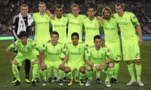
A lot of fans would include one of last year’s all-white efforts, when MLS was struck by a league-wide pandemic of blandness, but the Seattle Sounders’ 2010 ‘electricity’ third kit takes the unwanted accolade as the worst kit in MLS history. Were Adidas going for an inside-out look with this kit? Was this designed to double up as construction site apparel? Whatever the intention at the time, this kit has aged worse than Macklemore.


